iagogois.com.br
Context and problem
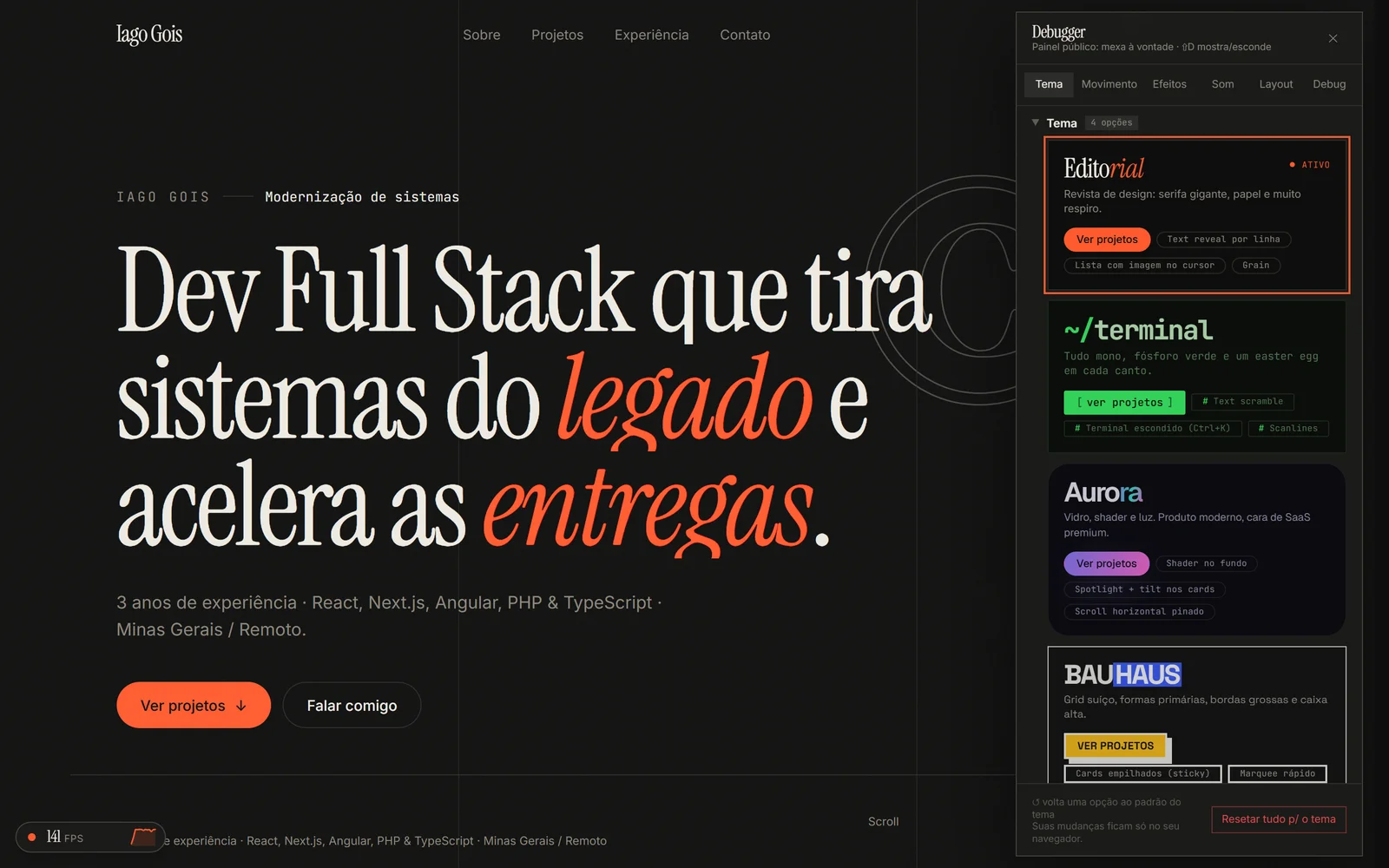
A developer portfolio needs to show what you deliver and your technical level. The site itself is the proof of the second: 4 complete themes, effects used with judgment and a public debugger where anyone can turn each effect on, off and tweak it. The full story is in the post How this site was built.
Technical decisions
Why a public debugger
Instead of hiding the process, the site shows how it works inside. Press ⇧D: every effect, color and layout can be tweaked and reset to its default.
Why measure before optimizing
On an animated site, smoothness during use matters too. A test opens the site in Chrome, scrolls to the end and measures every frame. Lite mode was rebuilt from those numbers, not from guesses.
Why only 2 or 3 effects per theme
It's not just about not looking junior: too many effects hurt the visitor's experience, and UX is one of the most important things on a site. Every feature has to make sense; too much becomes slop. So each theme picks a few signature effects and does them well, and every effect can be turned off.
Challenges
- 01The preloader covered the largest element on screen and LCP went over 3 seconds on phones. It went from 1.6 s to 0.4 s.
- 02A hydration error only showed up in production: dates were formatted in different time zones on the server and in the browser.
Outcome
- 35→63
- fps on phones, Aurora theme, lite mode
- 100
- SEO score on PageSpeed
- 4
- complete themes, in pt and en
Next case study
react-ui →